Analysis Results
The output from an analysis will differ for different types of input file. We will start by describing common features and then point out aspects specific to a particular input type.
Pathway listings
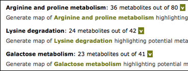
Initial results list in bold the pathways in which potential metabolites have been detected. The list is ordered by number of metabolites. Clicking on the ‘V’ for any pathway will list metabolites, clicking on the link will generate a marked map. These options are dealt with in turn.
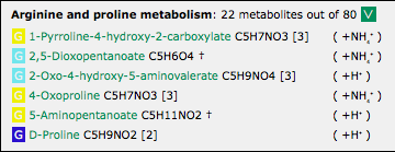
Metabolite Listings
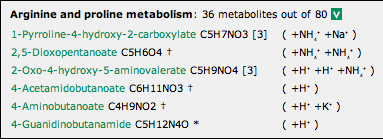
A metabolite listing is shown above.
- The name of the metabolite provides a link to a small pop-up window showing its structure and (except for Kegg ID input) a listing of other metabolites with the same formula, if any.
- The formula is given next, and (except for Kegg ID input) an indication of its isomer status: an asterisk where it is unique to all Kegg maps, a dagger where it is unique to the particular Kegg map, or an indication of the number of isomers in the Kegg map.
- Mousing over a formula highlights it and any other isomeric instances of it.
- If the ‘Adducts’ option for the analysis was selected, the adduct(s) detected are shown in parentheses.
The listing may be closed again by clicking on the ‘V’.
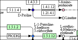
Pathway Maps
Clicking on the link to generate a marked map initially brings up a window with a ‘busy’ indicator. The maps are generated by Kegg’s web service in Japan, and you may have to wait 15 sec or more. Please be patient.
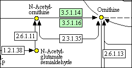
The detail above shows some metabolites that have been detected, automatically coloured yellow. (The green colouring of enzymes indicates that they are known to be present in the organism selected.)
The detail below is for experimental input, and shows metabolites that have been detected, automatically colour-coded on the basis of the percentage change in the experiment (deepest blue = largest increase, yellow = no change, deepest red = largest decrease). In this case the coloured circles are ‘hot-spots’: links to the bar-charts of results, which can also be obtained from the listing (next section).
The windows containing the maps can be moved and resized. They cannot be minimized.
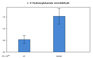
Bar charts of experiments
For experimental input the metabolite listing provides links to the experimental results for that metabolite (as do the ‘hot-spots’ in the pathway maps, above).
Clicking on a ‘G’ (for graph) invokes a bar-chart in a pop-up window, as shown at reduced size below.